Introduction to Web Design Trends
In the rapidly evolving digital landscape, staying attuned to the latest web design trends is paramount for businesses and web developers alike. As user expectations shift and technological advancements emerge, web design trends have the power to significantly influence user engagement, affect search engine optimization (SEO), and ultimately impact overall business success. Keeping abreast of these trends ensures that websites remain not only aesthetically pleasing but also functionally efficient and user-centric.
One of the key reasons to stay updated with current web design trends is to enhance user engagement. Websites that incorporate modern design elements tend to attract and retain visitors more effectively. For instance, clean and intuitive user interfaces, interactive features, and mobile-friendly designs can greatly improve the user experience, leading to longer visit durations and lower bounce rates. Additionally, such designs often utilize responsive layouts, ensuring compatibility across various devices and screen sizes, which is crucial in today’s mobile-dominated environment.
Moreover, following contemporary web design trends can give a strategic edge in SEO. Search engines favor websites that offer seamless navigation and fast loading times. Updated design practices usually include optimizing images and leveraging white space, which can significantly boost page speed. Furthermore, user-centric designs often encourage higher engagement and social sharing, indirectly enhancing a site’s search engine ranking.
Understanding and implementing the latest web design trends also reinforces a business’s brand identity and credibility. A website that appears outdated can be detrimental, as users may associate its aesthetics with the quality of the business itself. Conversely, a modern, innovative design can convey professionalism, fostering trust and credibility among visitors.
Throughout this blog post, we will delve into some of the most engaging and innovative web design trends to look out for this year. By the end, you’ll have a comprehensive understanding of how to leverage these trends to create a dynamic and user-friendly website that stands out in the competitive digital marketplace.
“`html
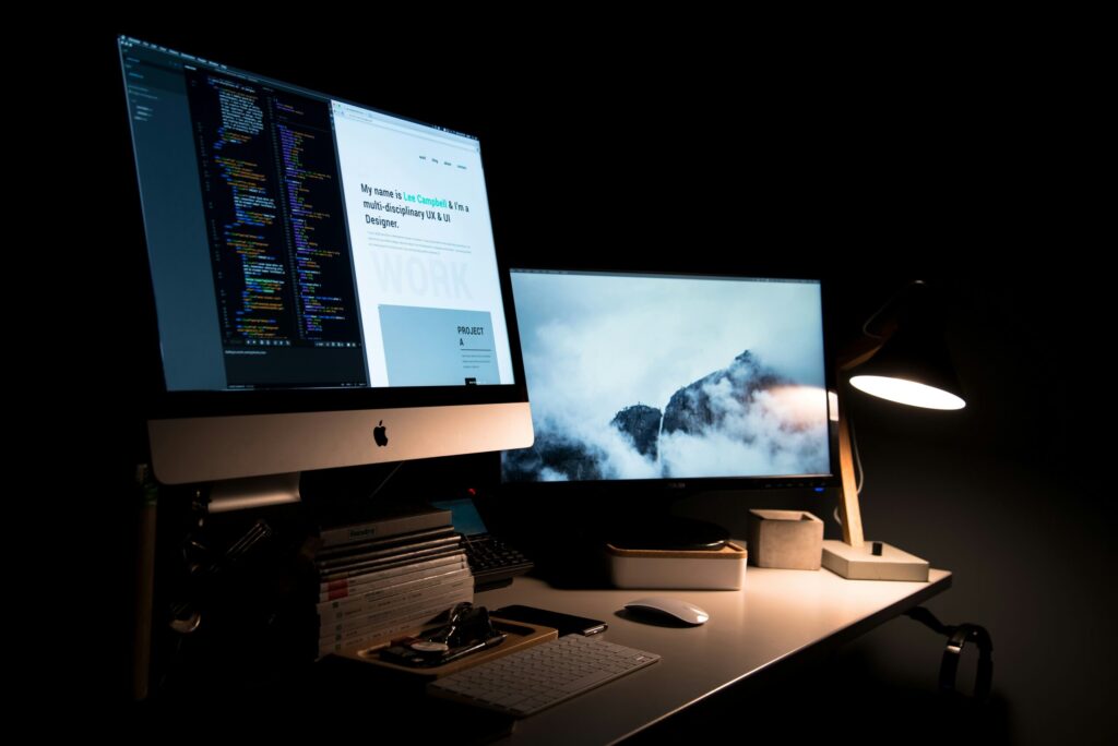
Dark Mode Design
Dark mode design has emerged as a dominant trend in web design, driven by its myriad benefits and widespread adoption across leading websites and applications. This innovative approach, characterized by its dark background and light text, offers several tangible advantages that contribute to its growing popularity. One of the primary benefits is its potential to reduce eye strain, particularly in low-light environments. Screens with bright backgrounds can cause significant discomfort during extended use, whereas the subdued tones of dark mode provide a more comfortable viewing experience.
Moreover, dark mode plays a crucial role in preserving battery life on devices with OLED or AMOLED screens. These display technologies allow individual pixels to be turned off when displaying true black, leading to reduced power consumption. This makes dark mode not only an aesthetically pleasing option but also a practical one, enhancing the device’s efficiency and longevity.
In addition to these functional benefits, dark mode imparts a sleek and modern look to digital interfaces. It creates a striking contrast with vibrant colors, enabling important elements to stand out while contributing to an overall sophisticated visual style. Websites and applications leveraging this design trend often appear more contemporary and visually appealing.
Several leading digital platforms have successfully embraced dark mode, demonstrating its effectiveness and versatility. For instance, major operating systems like Windows and macOS offer system-wide dark mode options, aligning with this trend’s rising popularity. Furthermore, applications such as YouTube, Twitter, and WhatsApp have integrated dark mode into their user interface, allowing users to switch seamlessly between modes based on their preference or lighting conditions. These examples underscore the trend’s adaptability and its significant impact on user experience.
“`
Neumorphism
Neumorphism, also referred to as soft UI, is emerging as a significant trend in web design. By blending elements of skeuomorphism and flat design, neumorphism achieves a unique visual style that mimics physicality through subtle shadows and highlights, giving user interfaces a soft, extruded plastic look. This design approach creates an almost tactile experience, making digital elements appear convincingly tangible.
One of the paramount benefits of neumorphism is its ability to craft intuitive and engaging user interfaces. The use of soft shadows and gradients can visually suggest interactivity and depth, providing users with clear cues on clickable or draggable items. This can enhance the overall user experience by making navigation more seamless and engaging.
Additionally, neumorphism can introduce a modern aesthetic that stands out due to its distinctiveness. By straddling the line between familiarity and innovation, it offers a fresh alternative to the stark minimalism of flat design and the exaggerated realism of skeuomorphism. Websites and applications utilizing this style can thus offer a visually appealing and user-friendly experience.
However, not all aspects of neumorphism are advantageous. One potential drawback is its accessibility concerns. The reliance on subtle shadows and highlights can pose challenges for users with visual impairments or those who rely on high contrast for better readability. If not implemented thoughtfully, neumorphic designs might fall short on color contrast standards, potentially impacting usability. Therefore, designers must balance aesthetics with functionality, ensuring that the interface remains inclusive and accessible to all users.
In summary, while neumorphism introduces an innovative visual style that offers engaging and intuitive interfaces, it requires careful consideration to maintain usability and accessibility. As web design trends continue to evolve, balancing form and function will be key to leveraging the benefits of neumorphism effectively.
Micro-Interactions
Micro-interactions are subtle, yet powerful design elements that respond to user actions and provide immediate, tangible feedback. These small animations or transitions can significantly enhance user experience by making interactions more intuitive and engaging. They encompass a wide range of features, from a button that changes color when clicked, to an icon that animates to indicate a completed action. Micro-interactions create moments that delight users and make the digital environment more intuitive.
The primary goal of micro-interactions is to guide users, convey system status, or provide feedback. For example, a loading spinner offers visual confirmation that the website is processing a request, thus preventing users from feeling confused or frustrated. Similarly, a “like” button animation not only confirms the action but also adds an element of emotional engagement. These small details can elevate the overall user experience, making interactions feel more responsive and human.
Effective micro-interactions share several common characteristics. First, they should be invisible until needed, manifesting only when a user takes a particular action. Second, they should be contextually appropriate and enhance the user’s journey without causing a distraction. For instance, a slight shake of an incorrect password field not only draws attention to the error but also subtly guides the user toward correcting it. Lastly, micro-interactions should be consistent across the site or application to establish a predictable user interface.
Implementing micro-interactions requires a balance between functionality and aesthetics. Overloading a website with too many can lead to a cluttered and overwhelming user experience. Instead, focus on essential touchpoints, such as form submissions, navigation gestures, and notifications. Keeping micro-interactions short and smooth ensures they contribute to the flow rather than interrupt it. Leveraging CSS and JavaScript libraries can simplify the creation of these interactions, ensuring they are both lightweight and effective.
By incorporating well-designed micro-interactions, web developers can create more engaging, user-friendly interfaces that not only draw users in but also keep them coming back. These small, thoughtful design elements can transform mundane tasks into delightful experiences, reinforcing positive user perceptions and driving overall satisfaction.
3D Elements and Parallax Scrolling
In the rapidly evolving landscape of web design, incorporating 3D elements and parallax scrolling has emerged as a significant trend. These visual effects enrich the user experience by rendering a more immersive and interactive interface. With advancements in technology, implementing 3D elements on websites has become more accessible, allowing designers to create stunning visual narratives. For instance, e-commerce platforms utilize 3D product visualizations to enable customers to explore items from various angles, thereby enhancing the shopping experience.
Similarly, parallax scrolling introduces a dynamic layer to web pages by creating an illusion of depth as users scroll. This technique involves background images moving at a different speed than the foreground content, crafting a more engaging and visually appealing experience. Websites such as “Nike’s Better World” and “Spotify Taste Rewind” have effectively deployed this technique to captivate visitors, guiding them seamlessly through the content.
However, integrating these elements is not without challenges. One of the primary technical considerations is ensuring that the site remains responsive and loads efficiently across different devices. Overuse of 3D elements can lead to slower page loading times, which may detrimentally affect user engagement and SEO performance. Therefore, it is crucial for designers to strike a balance between aesthetic appeal and functional performance.
Moreover, the implementation of parallax scrolling should be approached with a user-centric mindset. While it can enrich the visual experience, it should not hinder the usability or accessibility of the website. Careful attention to detail and thorough testing are vital to ensure that these sophisticated design elements enhance, rather than detract from, the overall user experience.
In conclusion, while 3D elements and parallax scrolling offer exciting opportunities to create captivating and interactive web designs, they require careful consideration and strategic implementation. By prioritizing a balance between innovative visuals and performance, designers can harness these trends to deliver a superior user experience that stands out in the digital space.
Voice User Interface (VUI)
Among the emerging web design trends, Voice User Interface (VUI) stands out as a transformative force acknowledging the growing ubiquity of voice-activated devices. As smart speakers, virtual assistants, and voice-activated applications become household staples, web designers are integrating VUI to align with these technological advancements. This trend is shaping the online experience by offering users a more accessible and convenient interaction model.
Improved Accessibility: One of the paramount benefits of VUI is its ability to enhance website accessibility. For individuals with disabilities, voice commands provide an alternative method to navigate and interact with web content, potentially breaking down barriers posed by traditional interfaces. By integrating VUI, designers can make their websites more inclusive, ensuring a seamless user experience for a broader audience.
Enhanced Convenience: Additionally, VUI offers unparalleled convenience, allowing users to execute tasks hands-free and multitask with ease. For instance, consumers can search for products, ask for recommendations, and navigate websites all through voice commands, without needing to manually interact with their devices. This level of efficiency aligns with the fast-paced nature of modern life, making VUI an attractive feature for both users and businesses.
Successful Implementations: Various notable examples illustrate the effective utilization of VUI in web design. E-commerce giants like Amazon and eBay have successfully incorporated voice search capabilities, allowing users to find products swiftly and efficiently. On the other hand, news websites such as NPR offer voice commands to play or pause audio content, ensuring a user-friendly experience. These implementations underscore the versatility and potential of VUI in diverse web contexts.
As the prevalence of voice-activated technology continues to rise, the integration of Voice User Interface in web design will undoubtedly become more pronounced. This trend not only elevates user experience through improved accessibility and convenience but also showcases the innovative spirit driving the web design industry forward.
“`html
Asymmetrical Layouts
Asymmetrical layouts are gaining substantial traction in the world of web design, representing a shift from the conventional grid-based structures. By breaking away from traditional symmetry, these unconventional layouts offer a refreshing dynamic to websites. The crux of asymmetrical design lies in its ability to create visual excitement and engagement. Websites employing asymmetrical structures can direct users’ attention towards key content elements more effectively, often through the strategic placement of images, text, and interactive components.
One of the major benefits of asymmetrical layouts is their ability to stand out in a crowded digital landscape. Traditional grid-based designs, while functional, can sometimes feel generic and uninspired. In contrast, an asymmetrical approach offers a unique, memorable aesthetic that can leave a lasting impression on users. This method of design is particularly useful for creative industries, such as graphic design portfolios, art galleries, and fashion websites, where visual impact is crucial.
Well-executed examples of asymmetrical layouts can be seen in the websites of companies such as Nike, where the design fluidly adapts to the brand’s dynamic and energetic identity. Another compelling example is Apple’s promotional pages, which often break the mold of traditional web design to highlight new product features and innovations in a visually captivating manner. These layouts are meticulously crafted to ensure that, despite their apparent randomness, they maintain an intuitive user experience.
The key to a successful asymmetrical layout lies in balance and intentional focal points. While the design may appear irregular, it should still guide the user seamlessly through the content. Effective use of white space, contrasting colors, and varied typography can enhance the overall functionality of the design. Ultimately, asymmetrical layouts offer a versatile and engaging approach to modern web design, encouraging a more interactive and visually stimulating user experience.
“`
Sustainability in Web Design
As we embark on a new era of digital innovation, the imperative of sustainability in web design is becoming increasingly prominent. Modern web designers are not merely focused on aesthetic appeal and functionality but are also prioritizing eco-friendly practices that contribute to a healthier planet. This shift reflects a broader awareness within the industry about the environmental impact of digital activities and a collective effort to mitigate these effects.
One of the primary ways designers are addressing sustainability is through optimizing website performance to reduce energy consumption. By streamlining code, utilizing efficient algorithms, and minimizing server requests, websites can operate more efficiently, thus consuming less energy. Techniques such as lazy loading, efficient caching, and reducing image sizes are increasingly popular among developers aiming to create leaner, greener websites. Additionally, leveraging compression technologies and CDNs (Content Delivery Networks) can significantly enhance performance while reducing the carbon footprint.
Another significant trend in sustainable web design is the adoption of green hosting services. These hosting providers utilize renewable energy sources such as wind and solar power to run their servers. By choosing such services, designers can dramatically decrease the environmental impact associated with maintaining online presence. Providers like GreenGeeks, EcoHosting, and Kualo are at the forefront of offering eco-friendly solutions, thus empowering web creators to support sustainability through their choice of hosting platforms.
To create more sustainable web designs, designers can also incorporate features like dark mode, which not only enhances user experience but also conserves energy on OLED and AMOLED screens. Furthermore, it is beneficial to adopt minimalist design principles, which not only improve load times but also reduce excessive data transfer, thereby saving energy.
Examples of environmentally conscious websites abound. A notable instance is the website of the environmental organization “EarthHero.” It employs an eco-friendly hosting service and a clean, optimized design that prioritizes performance without compromising on accessibility or visual appeal. Another example is “Ecosia,” the search engine that plants trees with its ad revenue and emphasizes sustainability in its operational design.